

This month,Pantone, the longtime global authority on color trends and standards for the design industries, revealed the spring 2016 edition of its semiannual Fashion Color Report. As high-fashion is often a forerunner to styling for home furnishings in line, design, texture and color, the latest 10-shade installment from the institute predicts the season’s most prominent shades in both fashion and interior design.
Spring’s palette is calm and cool, paying homage to natural resources and influenced by an emerging desire to disconnect from technology and unwind. The selection aims to represent current conditions of the world, both organic and constructed.
Designers and industry experts, such as Ken Downing, fashion director at Neiman Marcus, drew inspiration from the contrast of urban design and lush vegetation, “leading to unexpected color combinations and collections reminiscent of architecture, travel and nostalgia,” according to a press release issued by Pantone. South of the border destinations and Cuba were noted as influencers as well, inspiring designers to couple vibrant hues with more quiet, classic, and neutral tones.
“The color palettes of this season transport us to a happier, sunnier place where we feel free to express a wittier version of our real selves,” said Leatrice Eiseman, executive director of the Pantone Color Institute. “Yet with our culture still surrounded by so much uncertainty, we are continuing to yearn for balance by incorporating those softer shades that offer a sense of calm and relaxation.”
View and download the comprehensive report, here.

Rose Quartz— “A persuasive yet gentle tone that conveys compassion and a sense of composure.”

Peach Echo— “An [orange] shade that emanates friendlier qualities, evoking warmth and accessibility.”

Serenity— “Like the expanse of the blue sky above us, Serenity, [a transcendent blue], comforts with a calming effect, bringing a feeling of respite even in turbulent times."

Snorkel Blue— “Playing in the navy family, but with a happier, more energetic context, the maritime inspired, Snorkel Blue implies a relaxing vacation and encourages escape.”
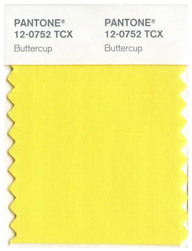
Buttercup— “With Buttercup, designers reveal a shining beacon transporting its wearer to a happier, sunnier place.”
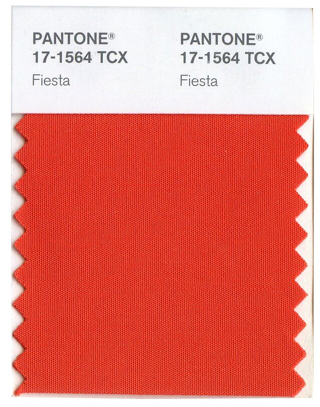
Fiesta— "The high energy Fiesta is a harbinger of excitement, encouraging free-spirited exploration to unknown but welcoming locales.”

Lilac Gray— “The subtlety of the lilac undertone in Lilac Gray adds a distinctive edge to this classic gray shade.”

Iced Coffee— “With its natural earthy quality, the softness and subtlety of Iced Coffee creates a stable foundation when combined with the rest of this season’s palette.”

Limpet Shell— “A shade of aqua that leans toward the green family, Limpet Shell is clear, clean and defined.”

Green Flash— “Green Flash calls on its wearer to explore and escape the mundane, radiating an openness that combines with the rest of the palette in unexpected but serendipitous ways.”


