Best Overall Custom Home of the Year
Jamestown, R.I., Residence
CUSTOM HOME proudly presents the winners of the 2003 Custom Home Design Awards. Thirteen inspiring projects rose to the top of a record-breaking field of 375 entries to capture this year’s honors. The 10 Merit Award winners, two Grand Award winners, and the 2003 Project of the Year are showcased in this 32-page feature. The projects were chosen by a panel of distinguished judges, all accomplished custom home professionals:They are Charles Barry, a partner in the Boston-based custom home building firm Thoughtforms; Dick Clark, AIA, principal of Dick Clark Architecture in Austin, Texas; Robert J. Gurney, FAIA, whose architectural practice is based in Alexandria, Va.; and John Lerchen, a builder of architect-designed custom houses in Indianapolis. We thank them all for so generously giving their time and expertise to the Custom Home Design Awards program.
The traditional New England concept of a main house with outbuildings gradually added on over time, known as “continuous architecture,” holds an evocative power. It calls up images of harsh winters, short but glorious summers, and homeowners with an abiding respect for their land.
Ladds’ client is a glass artist who works at home, so the house had to function as both a residence and a workplace. The idea of separate buildings lent itself naturally to this dual purpose. For the garage and artist’s studio, he fashioned a 2,000-square-foot building with a curved shed roof. It sits at an angle to the 2,900-square-foot main house so that the east ends of both structures almost touch. The resulting V-shaped plan allows water views and sunlight to enter a courtyard between the buildings. A sheltered entry pavilion completes the V, linking the home and studio and providing a mud room that serves both. “The separation of different areas works really well,” said one judge.
| |
| |
In addition to neatly dividing the live and work functions and optimizing the amount of sunlight that penetrates the building, the two-pronged plan also protects the courtyard from wind. This outdoor room is a key element of the plan; it gives the artist and his family a neutral zone that belongs to both the studio and the house.
Though the building’s cheerful collection of forms appears to be simple, Ladds in fact carefully calculated each design move. “There was a method to everything,” he says. The curved south wall of the main house, for example, exactly follows the sun’s path throughout the day. This element helps relate the building to its site and makes for an ever-changing shadow pattern inside. The lichen-green cedar planks cladding that wall are applied in a reverse board-and-batten pattern, with the battens behind the boards instead of over them. Each window along the curve measures precisely the same width as two boards. And the screened porch at the end of the wall owes its simplicity to more behind-the-scenes ingenuity. “We wanted the porch to be as light as possible, so it contains no structural members,” says Ladds. “The master bedroom above it is held up by cantilevered beams.”
The home’s interior proves a worthy match to its exterior, as Ladds employed cost-effective products and materials to create a dynamic atmosphere. A built-in maple bench runs the length of the curved first-floor wall. Glass plates cast by the owner form the main stairway’s central baluster. Beams of engineered lumber support the living room ceiling, instead of the steel Ladds originally planned. “There’s a cartoonlike quality to engineered lumber,” he explains. “It looks the way somebody might paint or draw lumber. Also, it’s a warmer material than steel.”
Ladds included an extra room lofted in a tower above the home’s second floor. The room has no specific purpose, which is just what he intended. “It’s a getaway,” he says. The room has a view of the Narragansett Bay and makes a great spot to read, contemplate, or think about nothing at all. The judges felt the same way about it that they did about the rest of the project. Said one, “I can look at this house and find almost nothing I don’t like.”
| | | |
Entrant/Architect: Lerner/Ladds + Bartels, Providence, R.I.; Builder: Ray Construction Company, West Greenwich, R.I.; Landscape architect: Beckman Weremay, Wickford, R.I.; Living space: 4,400 square feet (including studio); Site: 4.4 acres; Construction cost: $95 a square foot; Photographer: Warren Jagger Photography.
Merit Award
Custom Renovation
King George, Va., Residence
| |
| |
Adding to a mediocre house is a low-risk proposition; almost any reasonable change is an improvement. The stakes are higher when the original house is a gem. That was the case in this project, a new guest wing amended to a fine 1930s Moderne villa overlooking Virginia’s Rappahannock River. Architect Mark McInturff rose to the challenge with a contemporary addition that expands the function and fun of the original house without diminishing its dignity in the least.
With minimal disturbance to the plan of the main house, the addition provides a greatly enlarged kitchen space, informal dining and sitting areas, and a dramatic glass-box formal dining room at the first floor. At the second floor, a two-bedroom guest suite accessible only via its own back staircase maintains the privacy of the family, whose bedrooms occupy the second floor of the main house.
While executing the addition in his distinctive brand of Modernism, McInturff wove in shapes and materials—painted brick walls, standing-seam copper roofs, glass block—from the original home. The result is a building that progresses from one style and period to another without a jolt. As one judge noted, “The two coexist really comfortably.”
| | |
Entrant/Architect: McInturff Architects, Bethesda, Md.; Builder: Bonitt Builders, Alexandria, Va.; Landscape architect: G.P. Crowther & Associates, Annapolis, Md.; Living space (addition): 4,215 square feet; Site: 100 acres; Construction cost: Withheld; Photographer: Julia Heine; Elevation rendering: McInturff Architects.
Merit Award
Custom Home 3,000 to 5,000 Sq. Ft.
Hillsboro, Calif., Residence
| |
| |
The judges appreciated the subtle artistry evident in this 4,000-square-foot house outside San Francisco. “A lot of times, elegance gets confused with ornamentation,” said one. “This house doesn’t have all that—there’s nothing superfluous. It’s rich but still simple and clear.”
To achieve such a result, architects Steven House and David Thompson used clever siting, lush materials, and a carefully choreographed floor plan. They placed the garage toward the front of the site, blocking views of neighboring tract houses. A covered breezeway leads from the garage to the main house, creating a sense of procession that continues up through the entry. Three frosted glass panels limn the front door; at night, from the outside, it seems suspended within a softly lit frame. Inside, small squares of cherry set into the maple floor lead from the front door into the living and dining area.
An exterior mixture of taupe stucco and two different shades of stained wood break up the home’s massing. The roof angle follows the gently sloped site, and a curved, dual-level deck on the home’s rear takes advantage of views through a canyon to distant rolling hills. “The curved deck helps soften the house a little,” says House.
He and Thompson placed most of the rooms along that side of the house, saving the opposite, viewless side for corridors and closets. Luxurious maple and cherry detailing helps unify the open-plan first floor, and commercial-style steel windows make the most of the views and southern sunlight. Thoughtful architectural touches like the living room’s glossy cherry pillar complement the understated furnishings chosen by interior designer Barry Brukoff.
Entrant/Architect: House + House Architects, San Francisco; Builder: Innovation Builders, Emeryville, Calif.; Landscape architect: Terra Design Group, Sausalito, Calif.; Interior designer: Brukoff Design Associates, Sausalito; Living space: 4,000 square feet; Site: 0.75 acre; Construction cost: Withheld; Photographer: Tom Rider Architectural Photography.
Merit Award
Custom Kitchen
Telluride, Colo., Residence
| |
| |
It’s tough to give an award for a single outstanding room and not wonder about the rest of the house. That was especially true in the case of this Telluride, Colo., kitchen, whose complex geometry and arresting combination of materials left our judges anxious to know more. Playing it straight, we waited until after presenting the awards to ask project architect Larry Yaw for a bit of context.
Because the house sits on an exposed alpine-meadow site, Yaw says, “We had to create outdoor rooms.” The building’s angular shell is ringed with what he calls “eddy spaces,” sheltered nooks that enjoy both privacy and open views of the surrounding peaks. Yaw applied the same scheme inside the house, with a clearly defined kitchen that remains open to the flow of the house around it. A high, curved wall of hand-stained concrete and a low wall of gunmetal steel topped with a walnut counter conceal the nitty-gritty kitchen work without cutting off visual contact from the adjacent living and dining rooms.
| |
Surfaces that flow into the kitchen from those spaces—a limestone floor, board-on-board ceiling, and a wall paneled in standing-seam copper—connect the room with the larger volume around it. Precast concrete countertops, walnut cabinets, and a range and hood in dark patinaed copper further the very un-kitchenlike feeling. Our judges were struck by the room’s bold geometry and creative combination of materials, which they called “rich” and “unexpected.” Wait until they see the rest of the house.
Entrant/Architect: Cottle Graybeal Yaw Architects, Basalt, Colo.; Builder: James Hughes Construction, Telluride, Colo.; Landscape architect: Kristen Surette, Telluride; Interior designer: Studio Frank, Telluride; Living space (kitchen): 375 square feet; Site: 3.27 acres; Construction cost (house): $421 a square foot; Photographer: David Marlow.
Grand Award
Custom Home 3,000 to 5,000 Sq. Ft.
Horseshoe Bay, Texas, Residence
| |
| |
In planning this Texas vacation home, architect Rick Archer says, his clients asked for a “surprise house.” By all available evidence, that is exactly what they got. Certainly the neighbors in this architecturally conservative lakeside development were taken aback, and first-time visitors are bound to get more than they expect. Our judges were surprised, too. In a good way.
Approached from the courtyard, the house presents a façade of Texas sandstone, broken only by an entry that is something between a garden gate and a front door. Inside, things quickly become very interesting. Conditioned spaces are clustered in three pavilions linked by a covered, open-air circulation spine. Because the lot fronts on a man-made lake where no shoreline setback applies, Archer made the house itself the shoreline. The circulation spine opens on a stone patio with staircases that descend directly into the water. Sheltered parking includes not only a garage, but also a two-bay motor-in boathouse.
A granite outcrop on the site provided inspiration for the building’s rugged, monolithic forms. A shallow “V” roof form echoes a saddle between two distant hills that the house looks out on. Our judges admired the house’s bold shapes, which are rendered in stone and concrete—“basic building materials used in a very straightforward way,” one noted—and the application of cherry millwork and steel roof framing, “to relieve the brutalism of the concrete.”
Because this is a vacation home, Archer says, the owners were more open than most residential clients to an approach that draws somewhat outside the lines. But the house was designed also to be utterly practical. The pavilion-based plan allows the house to expand and contract according to the number of guests on hand. The main lakeside patio—or “beach” as Archer calls it—is an all-purpose launching platform for water sports. Despite its high-style character, one judge noted, “This house is zero-maintenance.”
Entrant/Architect: Overland Partners, San Antonio, Texas; Builder: Duecker Construction, Fredericksburg, Texas; Landscape architect: Bud Twilley Landscape & Courtyard Gardens, Austin, Texas; Interior designer: Emily Summers Design, Dallas; Living space: 4,300 square feet; Site: .5 acre; Construction cost: Withheld; Photographer: Paul Bardagjy.
Merit Award
Custom Home Under 3,000 Sq. Ft.
Door County, Wis., Residence
| |
| |
In a simple house, a single gesture can make all the difference. In this year-round second home on the shore of Lake Michigan, the inspired gesture is right overhead: a sweeping reverse-arch roof, surrounded by clerestory windows, that tops the main living space. The clerestory openings “throw light up against the ceiling and kind of bounce it around,” explains architect Jim Nagle, who designed the house for a long-time friend. The roof is supported by four laminated beams, which were fabricated locally at a very reasonable cost. “It was a very simple way to get a big bang,” Nagle says. “It’s like having a sail up over your head.”
Nagle’s program called for “a modest house, but something that fit in with the environment.” And at only 2,000 square feet, his straight-ahead Modernist plan is the very soul of modesty. Fitting in with the environment provides the entertainment here. “It’s in the woods and it’s right on Lake Michigan, sand beach out front,” says Nagle, who located the house to take advantage of the views without stepping all over the shorefront scenery. “We tried to nestle it back in the woods, so it doesn’t expose itself to the beach.” The building’s primary materials—fieldstone for the chimney, cedar siding, maple flooring, laminated pine roof beams—were all sourced locally.
Our judges gave the project high marks for the clarity of its plan and its appropriateness to the setting. They noted approvingly the building’s openness to the lake, and the discreet outside entrances to the two baths, which allow swimmers to clean off before entering the rest of the house. But they agreed that the sweeping roof and the quality of light it creates inside the building were the crowning touches. “Putting that roof on it takes it to another level,” said one. “I wouldn’t mind spending a weekend in that house.”
| | |
Entrant/Architect: Nagle Hartray Danker Kagan McKay Architects Planners, Chicago; Builder: Gray Construction, Bailey’s Harbor, Wis.; Living space: 1,875 square feet; Site: 1.6 acres; Construction cost: $175 a square foot; Photographer: Bruce Van Inwegen.
Merit Award
Custom Home More Than 3,000 Sq. Ft.
Laurel Mills, Va., Residence
| |
| |
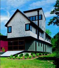
Once the question was, “How you gonna keep ’em down on the farm?” Today a more apt query might be, “How are we gonna get back there?” For hassled, frazzled urbanites, the open spaces and quiet of the agrarian life hold a powerful allure—at least in a weekend retreat. This weekend home on 300 acres in the Virginia mountains is no farm, but it draws on the now romantic images of farmhouse and barn, archetypal forms that suggest a simpler, slower way of life. Here those forms are abstracted, broken down, and assembled in a kind of collage that adds a knowing urban twist.
Stretched out in a linear footprint that maximizes views of the surrounding countryside, the structure is organized as if it were assembled of smaller, separate buildings. Interior functions are expressed in the building shell as semi-discrete elements, delineated by changes in color, roof form, and siding material. Deep recesses in the building’s perimeter create outdoor sitting areas, including a two-story covered porch whose timber-framed roof and red board-and-batten siding suggest a barn somehow turned inside out.
Blue-collar materials—concrete block masonry, grey stucco walls, more red board-and-batten—wrap into the interior of the house, where they harmonize well with the more refined maple floors and stainless steel railings. “The nice thing about this project,” one judge observed, “is the consistency between interior and exterior.”
Entrant/Architect: McInturff Architects, Bethesda, Md.; Builder: Rappahannock Design & Building, Washington, Va.; Living space: 8,000 square feet; Site: 300 acres; Construction cost: Withheld; Photographer: Julia Heine.
Merit Award
Custom Home 3,000 to 5,000 Sq. Ft.
Chevy Chase, Md., Residence
| |
| |
Architect David Jameson did not have “mansion” on his mind when he designed his family’s new home in a long-established suburb of Washington, D.C. Instead, he combined good design with neighborliness and built a house that, while Modern and 4,400 square feet, settles comfortably amid the smaller cottages and bungalows that surround it.
In order to respect the neighborhood scale, Jameson felt compelled to “break down the volume of our bigger house into articulated parts.” His design used two parallel but distinct volumes, a gable and a barrel vault, tied together by a gallery. He pulled the traditional gable form toward the street, where it echoes the forms of surrounding houses. The more modern vaulted volume is pushed back behind a large cedar, diminishing its impact on the streetscape. The front entry stands out with a lead-coated copper brise-soleil that abstractly mimics nearby porches. The jury particularly liked the “simplicity of geometric volumes put together in a nice way.”
| |
Inside, Jameson stuck to a time-honored floor plan of formal areas flanking the foyer and more casual spaces in back. The interior is treated with crisp drywall detailing and finished with sleek materials like polished black granite, stainless steel, frosted glass interior walls, and natural maple floors. Airy rooms feature exacting patterns of clear glass that admit daylight while cleverly framing slices of nature. Jameson speced floor-to-ceiling windows and doors to give the illusion of height to 8-foot ceilings. Although his contemporary aesthetic demanded a double-tall family room, Jameson also wanted to feel comfortable with two or 20 people in it. “By creating a personable scale with wall and window details,” he says, “you can make open spaces work as everyday living for a small family.”
Entrant/Architect: David Jameson Architect, Alexandria, Va.; Builder: Heslip Construction, Chevy Chase, Md.; Living space: 4,400 square feet; Site: .17 acre; Construction cost: Withheld; Photographer: Hoachlander Davis Photography.
Merit Award
Custom Kitchen
Cincinnati Residence
| |
| |
Architect John Senhauser knows the value of a well-designed house. “It’s like owning a classic jacket,” he says about his renovation of a 1968 house by Cincinnati Modernist Carl A. Strauss. “It’s perfectly serviceable, but the lining is worn. So you go back and put a new lining in.”
The “new lining” he created for the home’s kitchen results from a series of small but effective moves. Senhauser didn’t want to change the room’s footprint, but the space felt cramped and dark. So he raised most of the ceiling by a foot. He also removed a former laundry room and the old pantry to make space for a new butler’s pantry, and filled in one of two doorways on the north side of the kitchen to allow for more counter space. Then he transformed a floor-to-ceiling peninsula into an island, creating a second opening from the breakfast room into the kitchen. Now light and views flow in through the breakfast room windows, over the island and through the new doorway.
| |
Senhauser chose materials that maximize natural light and integrate the kitchen with the rest of the house. “We used no paint in this house, except for the white-painted brick,” he says. “All of the color comes from the materials themselves.” Cases in point: the mottled, gray-green slate floor, black-and-white-speckled granite countertops, and a light-green glass backsplash. Senhauser did break his own rule on color by staining the cabinets with a blue-gray aniline dye, which helps unify them with the stainless steel appliances. But the judges didn’t mind. “They truly brought it into today,” said one. “It was a nice house in the 1960s, and it’s a nicer one now.”
Entrant/Architect: John Senhauser Architects, Cincinnati; Builder: Stewart & Jervis, Cincinnati; Living space: 625 square feet (kitchen and breakfast room), Site: 6.3 acres; Construction cost: Withheld; Photographer: Corson Hirschfeld Photography.
Grand Award
Custom Home Under 3,000 Sq. Ft.
Pella, Iowa, Residence
| |
| |
The very aspect of this house that impressed the judges the most—a crisp, clean form that almost floats above its Pella, Iowa, site—came close to turning out very differently. Architect Paul Mankins developed three separate schemes for the project: a “bridge” house that spanned a small ravine; a plan shaped like a bowtie; and a scheme consisting of a squared-off tube topping a concrete base. The clients chose the third option, and Mankins and his colleagues were on their way. “It’s a perfect geometric shape sitting on the landscape,” said one judge.
The effortless grace with which the house appears to brush the land actually results from a hard-working set of parts. The cast-in-place concrete base, which Mankins refers to as the “bunker,” is dug into the slightly sloped site. Contractor Legacy Builders cantilevered a wood-framed tube over the bunker, stabilizing it with cross-braces. “The cross-bracing allows us to have the tube open on one end,” says Mankins. “Basically, the idea was that we would build the tube and point it at the view.” The idea worked. Vistas of pasture and pond stream in through the windows covering the entire 24-by-24-foot opening.
| |
Because the clients’ budget was limited, Mankins had to design a simple floor plan and get creative with materials. An open first floor contains the kitchen, dining room, and double-height great room. He lofted the master bedroom up above the kitchen and dining room, giving it access to the light and views entering through the end of the tube. The home’s lower level holds additional bedrooms and a rec room, all of which open out onto a patio.
Since the house has such an open plan, most of its natural light comes from that 24-by-24-foot window wall. The only fenestration along its standing seam metal-clad sides consists of two sets of glass doors flanking the dining room. A crumpled fabric made from stainless steel threads is used as a privacy screen along the master bedroom railing and the deck railings; it adds texture and lets light through without costing a fortune. Pieces of chalkboard provide an inexpensive fireplace surround that resembles slate, and cost-effective asphalt shingles cover the home’s roof, which is nearly impossible to see from the ground.
| |
Thanks to a set of bookshelves that cuts through all three stories, the building’s form looks just as powerful by moonlight as it does during the day. Lumasite, a translucent plastic, backs the birch shelves. When the sun sets and the owners switch on their lamps, the effect of light shining through the shelves turns the whole house into a glowing box.
Entrant/Architect/Landscape architect/Interior designer: Herbert Lewis Kruse Blunck Architecture, Des Moines, Iowa; Builder: Legacy Builders, Pella, Iowa; Living space: 2,785 square feet; Site: 4 acres; Construction cost: $150 a square foot; Photographer: Bob Shimer/Hedrich Blessing.
Merit Award
Custom Renovation
Chevy Chase, Md., Residence
| |
| |
It’s hard to see now, but this 57-year-old Ranch had many of the problems that often afflict that genre: poor circulation, a rabbit warren of chopped up rooms, insufficient storage, and poor daylight, to name a few. Architect David Jameson’s renovation scheme replaced the negatives with good planning and stylish design for what the judges termed “a clever transformation of a problematic Ranch house.”
Jameson’s first move was to transform the existing garage, which occupied a prime location near the pool, into a glass-walled master suite oasis. Then he rationalized circulation by moving the front door to the center of the house and forming a gallery hallway that provides balanced access into various rooms.
| |
Though the roof height couldn’t be altered, Jameson avoided the “dastardly expanse of never-ending 8-foot ceilings” by creating “fissures of light” within the framing. Two 5-by-12-foot skylights were inserted into the ceiling to fill the open kitchen/ dining/living area with natural light. At night, glowing spots artificially brighten the recessed boxes.
Jameson addressed another bane of Ranch houses—a lack of storage—with walls of steamed beech built-ins that line the gallery, living room, and master bedroom. He saved more space with a 5-by-8-foot custom sliding wall between the master bedroom and bath. The beech-and-sandblasted glass partitions permit the movement of light while maintaining privacy. A similar idea was applied in the kitchen where sliding opaque glass and brushed zinc panels conceal or reveal different sections of the upper cabinets at the owners’ whim.
Entrant/Architect: David Jameson Architect, Alexandria, Va.; Builder: Sabra Design, Kensington, Md.; Living space: 2,400 square feet; Site: .25 acre; Construction cost: Withheld; Photographer: Hoachlander Davis Photography.
Merit Award
Custom Renovation
Tiburon, Calif., Residence
| |
| |
Before House + House Architects got their hands on it, this bland, beige Ranch house couldn’t have been more unremarkable. By merely adding a room, making some slight structural changes, and saturating the project with offbeat color, they skillfully remade it into a place so pleasant that the judges themselves fantasized about living there. “That’s just a house I could hang out in,” said one. “It’s pretty amazing, especially considering what they started out with.”
Architects Steven House and Sonya Sotinsky started with the home’s one-story plan. They moved the formerly nondescript entry to the north side of the house, so it could easily be entered from the garage. And they added a walled garden between the buildings, “to create a sense of procession from the garage into the house,” says House. A family room addition and deck filled out the home’s rear yard, which looks toward a view of the San Francisco Bay. The architects also opened up the kitchen to the living and dining area, using the space gained by moving the entry to enable a more graceful traffic pattern between the rooms.
| |
When the time came to choose materials and finishes, the clients’ tight budget ruled out top-of-the-line items. Instead, House and Sotinsky used color and creative finishes to achieve the warm atmosphere that so impressed the judges. Black laminate tops the kitchen counters, while the same material in lime green covers the cabinets. Horizontal aluminum channels inject visual interest into the maple plywood paneling that functions as an accent throughout the home. The melon-colored, hand-plastered walls and bold, red-painted ceiling liven up the public spaces, while black-stained oak floors have a grounding effect on the entire house. “This project was about taking a relatively small house and using a rich palette to open it up,” House says.
Entrant/Architect: House + House Architects, San Francisco; Builder: Robert Guild General Contractor, Kentfield, Calif.; Landscape architect: Christine Swanson, Berkeley, Calif.; Living space: 2,150 square feet; Site: 1.7 acres; Construction cost: $135 a square foot; Photographer: David Duncan Livingston.
Merit Award
Custom Home Under 3,000 Sq. Ft.
Chicago Residence
| |
| |
The purest architectural ideas rarely make it off the page without getting pushed here and pulled there by the sloppy forces of reality. Only in designing their own homes do most architects stand a chance of holding the line against compromise. In his squeaky-clean mini-tower home, Chicago architect Frederick Phillips appears to have seized the gold ring of having a really cool idea and seeing it through to completion intact.
| |
Sited on a miniscule triangular lot in Chicago’s notorious Cabrini Green neighborhood, this urban pioneer packs 1,152 square feet of high-style living space onto less than 1,700 square feet of land. Its forms are bracingly simple: four stories of steel-framed structure, a concrete block stair tower for circulation, and a steel circular stair for secondary egress. Enclosed living spaces occupy the two middle levels of the main structure, which shelters a ground-level parking pad; the top level is devoted to a shaded roof deck. Materials are drawn from a utilitarian mix of steel and block, with slate floors and black granite countertops providing a sophisticated counterpoint.
Our judges praised the house’s efficient floor plan, crisply detailed modernist interiors, and high-rise-like urban views. But nothing about this house impressed them as much as the fact that it actually got built.
Entrant/Architect: Frederick Phillips and Associates Architects, Chicago; Builder: Ladner Construction, Chicago; Landscape architect: Peter Lindsay Schaudt Landscape Architecture, Chicago; Living space: 1,152 square feet; Site: .038 acre; Construction cost: $260 a square foot; Photographer: William Kildow.