When the world feels unsteady, people turn toward nature.
“Typically, when there’s unrest in the world, we tend to seek nature. It is a grounding reset that brings us comfort,” says Ruthanne Hanlon, National Color and Design Manager for Pittsburgh Paints.
The company’s latest color research reflects that impulse: a growing desire for calm, restorative environments that feel grounded, organic, and familiar.
Architects and designers of commercial spaces have long explored biophilia—the idea that natural cues help regulate mood and stress—but Hanlon says those principles are now filtering deeply into home design.
“It’s so easy to implement,” she says. “It can be as simple as painting a wall blue or green, using natural wood tones on cabinets or flooring, or even placing a small plant on a desk or on a windowsill. You can bring biophilia into any price point or décor style.”
At its best, the approach isn’t about literal greens and florals, but about what those elements evoke.
“Organic cues that aren’t overly saturated remind us of being outside and all the restorative properties of nature,” Hanlon says.
The key is restraint—avoiding acid-bright colors that overstimulate and instead choosing desaturated hues that hint at leaf, sea, or stone.
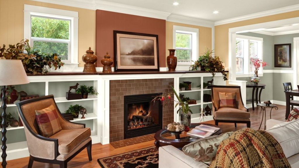
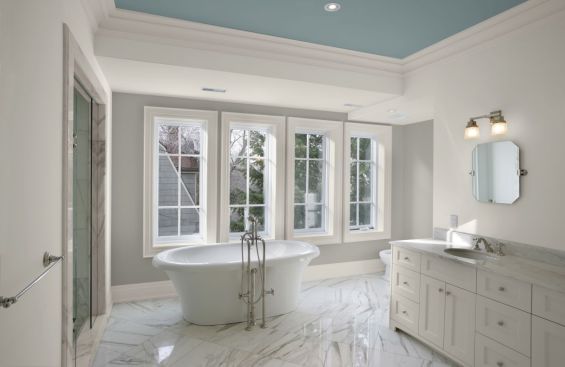
Hanlon points to three color families that consistently capture this feeling: greens, blues, and warm mineral neutrals.
“Greens and blues are obvious choices—they connect us to nature and water,” she says. “And the new beiges, those soft warm neutrals, remind us of driftwood, sand, and pebbles.”
Today’s neutrals, she adds, are a far cry from the red-based tones of the early 2000s.
“They’re being paired with smoky blues, neutral greens, charcoals, and whites—same family, completely different look.”
The difference between wellness and biophilia
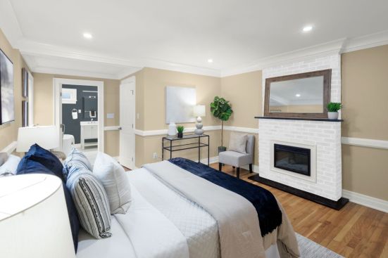
The words wellness and biophilia are often used interchangeably, and while there is some overlap, each is distinct. Wellness-oriented palettes bring a specific emotional register.
“Soft blues are especially powerful because they reflect water and evoke calm,” Hanlon says, citing Pittsburgh Paints’ Symphony of Blue—a mid-tone that avoids the “institutional” feel of lighter pastels. Similarly, Smokey Slate, a neutral-leaning green, bridges contemporary and historical looks.
“We’re also seeing a trend toward nostalgic hues. When there’s uncertainty, people go back to what they know, what makes them feel safe—colors that remind them of their parents’ or grandparents’ homes.”
That nostalgia extends to style as well. Hanlon sees a renewed appreciation for the geometry and elegance of Art Deco.
“It makes sense,” she says. “The 2020s mirror the 1920s in many ways—social change, technological leaps, people breaking norms and doing what works for them. And I love seeing those Deco lines and finishes return: burled woods, deep blacks, and rich metallics. It feels both classic and a little rebellious.”
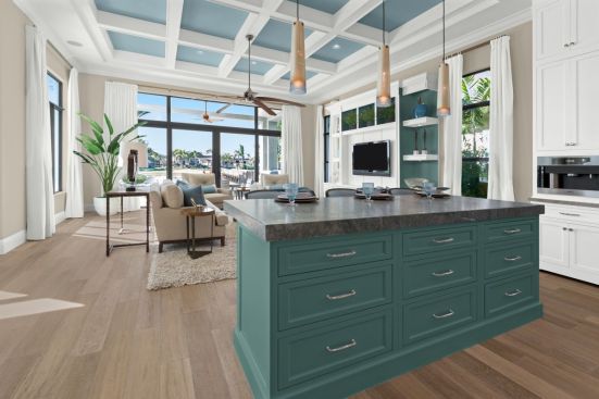
For architects and builders, Hanlon believes the current mood opens creative opportunities. Even in spec homes, she says, a touch of color can set a model apart.
“Buyers tour a dozen homes that all look the same—neutral, safe choices. But then they walk into one with a beautiful green feature wall or a painted kitchen island, and it stands out. Consumers aren’t as afraid of color as they used to be.”
Color highlights craft
She also recommends using color to draw attention to craftsmanship.
“Sometimes you walk into these beautiful new homes with coffered or tray ceilings, and everything’s white—you don’t see the detail. Try a slightly darker tone on the insets. Darker colors recede, so the ceiling feels taller and the architecture more pronounced.”
The same principle applies to built-ins: Painting the back panel a few shades deeper adds depth and a custom feel without visual clutter.
“You might even find you don’t need as much décor—the color does the work.”
To help clients articulate what feels right, Hanlon starts with a deceptively simple question: Are you more of a mountain person or a beach person?
“It tells me whether they lean toward darker, muted tones or lighter, ethereal ones,” she says. “It’s a great starting point for creating spaces that help people decompress after a long day.”
Pittsburgh Paints recently launched a new color tool built around that same idea—a dozen curated palettes organized by mood and aesthetic, such as “Winter Chill,” “Historic Charm” and “Coastal Cool.”
It’s designed to make color conversations easier for designers and homeowners alike.
“Not everyone works with color every day,” Hanlon says. “Sometimes they just need help getting started. And if they can tell you, ‘I like the beach better than the mountains,’ that’s all you need to go in the right direction.”
Learn more about Pittsburgh Paints’ 2026 Trends and Color of the Year.
The P Logo & Pittsburgh Paints are trademarks of The Pittsburgh Paints Co.