PPG Paints
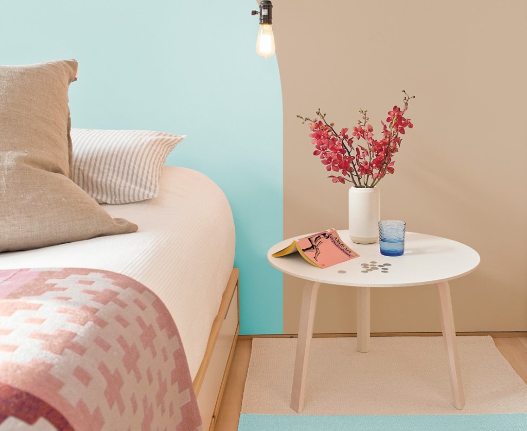
Based on the sudden lifestyle shifts and new priorities that have defined 2020, PPG Paints’ color experts have eschewed a single Color of the Year in favor of three soft neutral shades—Transcend, Big Cypress, and Misty Aqua. Combined, these colors form the “Be Well” palette, PPG’s first-ever 2021 Palette of the Year.
The selection is designed to fit the “60-30-10” rule of room color design—60% dominant color, 30% secondary, and 10% accent. Transcend, described by the manufacturer as a mid-tone oatmeal shade, draws on “earthly influences and nostalgia” to contrast the cool gray tones popular in previous years. Big Cypress balances the base tone with a slightly darker ginger shade, while Misty Aqua provides a fresh accent point against an earthy backdrop.
Taken together in the 60-30-10 arrangement, PPG recommends the palette for use against greenery, blonde or natural brown-tone woods, and rattan, linen, velvet, or woven textiles.
“With the world sheltering in place for the better half of the year, we have begun to crave human connection and embrace simple activities, including walking, hiking, baking, and gardening,” says Dee Schlotter, PPG senior color marketing manager for architectural and industrial coatings. “This organic and hopeful palette represents what we have been longing for after decades of overstimulation and overconsumption—simplicity and restfulness.”